Whatever this world really is, it is not very much math. “Machine” green, natural green, “bluey” green — there may be algorithms to process these, but the human visual impression is not going to be mathematical.
Much of print matter today is in overall luminosity darker than Renaissance. For green to show as green, places are composed with darker, even raven hues.
Select green yet can print good in CMYK.
High Dynamic Range, known as HDR, can impress of color crisp clarity. It is capable of vivid green in… CMYK, provided you print from HDR process pastels. It is enough we design a swatch or palette.
The test page below is CMYK, and look at the green. Others are Pantone-coated, but not even the Pantone would have the green. Your viewing conditions should be ICC Adobe98, for the real world rather than gaming realms.
I have been making the colors for ■my grammar book. I have been unable to come to terms with gloom, and this US Web Coated SWOP v2 looks good enough. I have always imagined my grammar in colors you can find in nature. Green is important: it is my auxiliary and language form relativity, that is, freedom from the Conditional, Unreal Past and likes. It can be freedom generally.


CMYK-defined RGB32, the process color, is capable of results close to natural greenery, but what we see before print is not always what we get after. On the left, you can the same test page is PNG before export.
In words most plain, RGB32 in CMYK print is like an unbound color space that works within a bound color space, and we really can learn to do it at home.
We would not use process pastels for painting, as then we need to see in real time, but fonts or preset elements should be fine: especially fonts tend to come out darker or with much less color, in CMYK. Paintings are not printed in CMYK.
Computers usually offer the wide gamut or ICC, that is, virtual reality or print profiles for display. We can color manage from the Settings: wide gamut for computer games, and ICC for “real colors”, that is, such that we can use for our products in this real physical world. Adobe 1998 is really good quality and recognized in many apps.
Back to the “before and after”, a swatch may look even grayish, and come out print green CMYK. We can define any color, for pastel CMYK. Defined pastels not only let us keep colors for logos and other such bits: more, they can add a little bit of color.
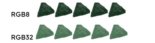
Below, red dots mark print outputs very difficult to obtain any other way in CMYK. I don’t know about any other way, and I have tired many. Maybe there is not.
The image on the right shows swatches and their print outputs in CMYK, HTML approximation, here simply for a green leaf. Below each row of pastels and their outputs there are the corresponding swatches and outputs without the process: vivid, which is progress from gloom, but not as color-rich.


To see the difference RGB32 is able to bring into CMYK, and it is enough to choose on the profile in PDF export, let us compare a CMYK green, CG32 in our HDR palette, done as textured vector brush in RGB8 and RGB32. Color profiling is going to make our HDR compatible even with everyday online converters. This means wide compatibility.
Most documents today are set to RGB 8 or 16 by default, but if we have designer software, the program is likely to have the RGB 32 option for anything we make from scratch (conversion of ready images might require that we “try-and-err”, to evaluate them for export).
If we work RGB32 for CMYK, we work higher specifics before export. It is altogether a good idea to work higher and reduce for compatibility. On the left here, there is a 600 dpi PNG edge; the 300 dpi is on the right; 550% magnification, both exported at 300. File size matters.

To work with high definition color, vector swatches are so good, that we always remember to lock them as layers.
Naturally, it would probably be best simply to get swatches to use. This is what I’m working on.
RGB32 has the advantage that CMYK does not generalize it the same as other palettes (lower RGB, 8 or even 24). RGB32 may become the preference for visual impressions of “clean color”.
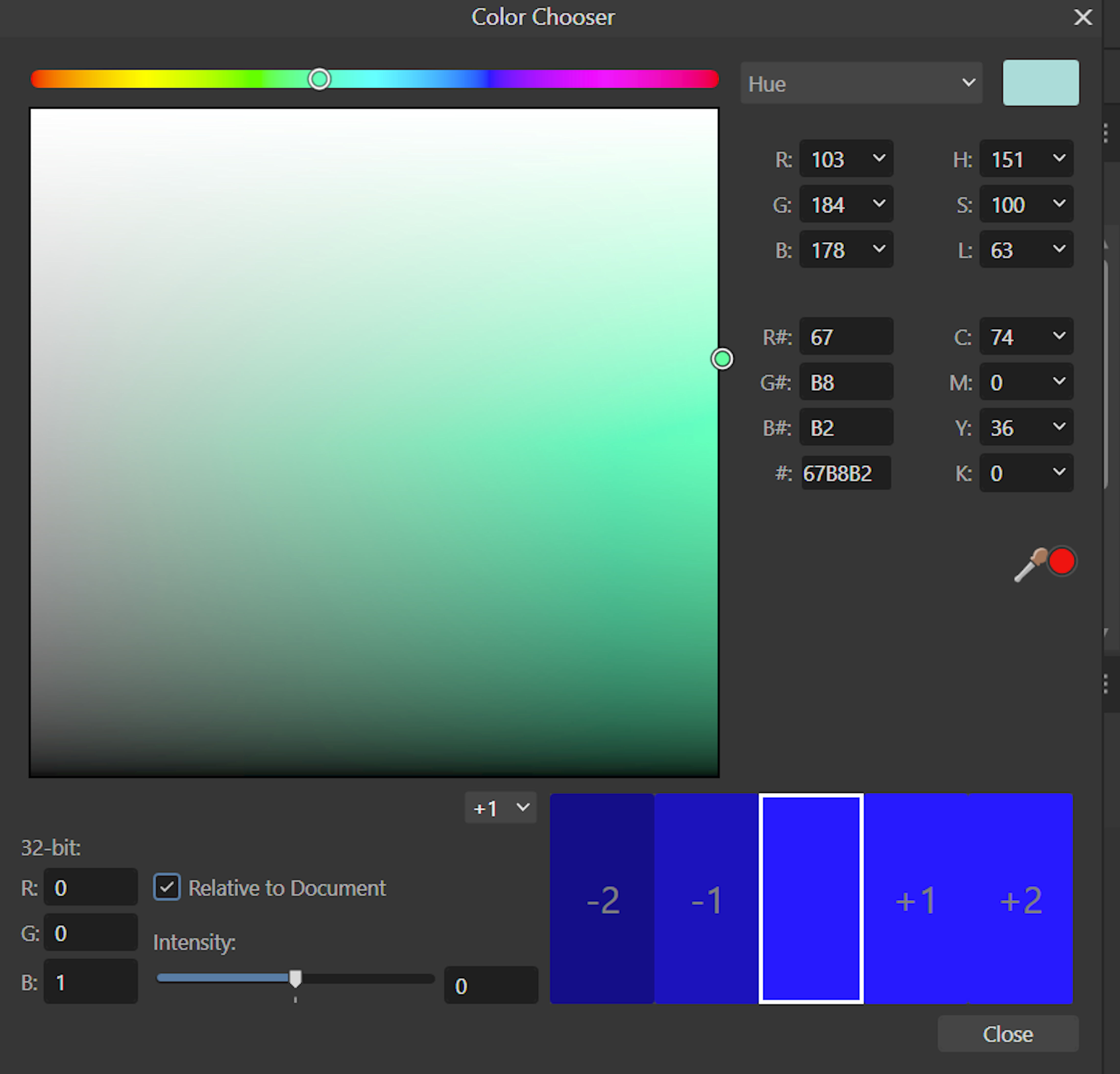
Here, with the HDR RGB 184, the colors are visually very similar. Their parameters for CMYK, RGB, and Hex are the same — but the HSL may give alternate results. The work from vector is in the picture on the right, when we write in values.


It is a matter for my next book in the series, on colors blue, but it is worth mention here already: human eyes are natural for color. Night skies look shiny in the “mystic B20”, that is RGB 0, 0, 20;
Hex 000014, HSL 240, 100, 4;
CMYK 76, 71, 62, 85 (the picture is only an approximation, html changes colors a bit).
Whereas the stars remain the same, they would not “shine” on a black background. We must look to natural impressions, to have good graphics. These are human eyes to see our products.
Free to download:
https://pixabay.com/photos/night-light-stars-nebula-veil-6601829/
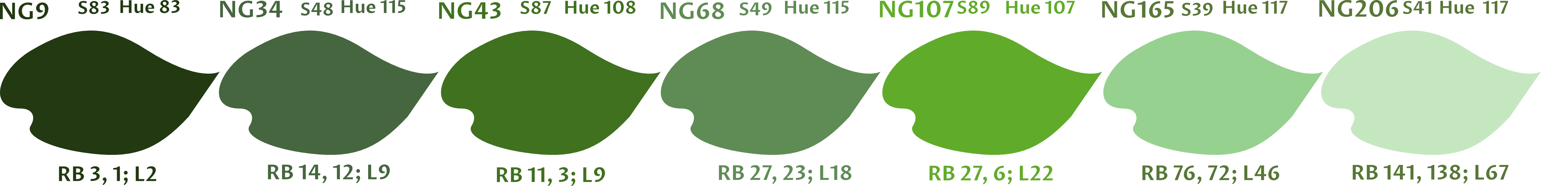
Well, for our BGs, “bluey” greens, the swatches all have the RGB proportion of blue higher than for red: exactly opposite to our natural greens, where red is irregularly and sometimes only a bit, but always the higher value (the picture here is an HTML approximation).

Let us see our NGs, natural greens, for comparison.
Work in progress.
